Learn Log Analysis with Matplotlib
What is Matplotlib
Matplotlib is a great Python library where you can output any line, histogram, bar, phase, circular, and more graphic formats on data with just a few lines of code. You can easily use information from nufus distributions in the country, from the graph of a mathematical equation, from any subject you can think of such as the speed of distribution of harmful software. He will respond to your business and needs in every subject that the statistics go into the business. In daily life, the subject can be applied on many issues by saying Let’s make girizgahına.
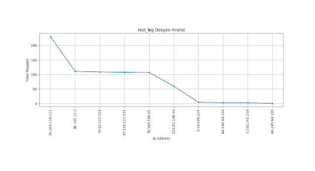
As mentioned above, access belongs to a website in this article.any access in the script we will write with the help of matplotlib using certain information in the log file.we will export the log file so that we can export the most requested IP addresses and request values to the graph. Let’s go!
How to Install Matplotlib
First of all, set up our library with the following command.
1 | pip3 install matplotlib |
Let’s start incorporating our libraries into our code.
1 2 3 | from matplotlib import pyplot as plt #The area where we draw the graphics(plot)) from sys import argv # We're getting an argument from the outside. |
The most requested n. we get our n argument value and log file name from outside as we will list it up to the record.
1 2 | logfile = argv[1] n = int(argv[2]) |
access.log each line of our file is listed as a list element.
1 2 | with open(logfile, "r") as f: log = f.readlines() |
Sonrasında log dosyamızdaki yalnızca ip sutununu alacak şekilde parse edelim ve ip değerlerimizi bir ip listesine atayalım.
1 | ip = [i.split()[0] for i in log] |
we reduce the repeat IP addresses in our log file to one.(To prevent it from happening again))
1 2 | uniq_ip = list() [uniq_ip.append(i) for i in ip if i not in uniq_ip] |
Now, let’s find the total number of requests from each IP. So the frequency.
1 2 | freq = list() [freq.append(ip.count(i)) for i in uniq_ip if i not in freq] |
In a list, we sort the IP and IP numbers in 2-element bundles according to the number of requests from size to size.
1 | eq = sorted(zip(freq, uniq_ip), reverse=True) |
Now, let’s determine our axis points to draw on the plota.
1 2 3 4 5 6 | y_axis = [i[0] for i in eq] # y axis # x axis. For each x point, make sure that the X and y list lengths are equal because an y point corresponds to each x point. x_axis = range(len(y_axis)) x_label = [i[1] for i in eq] # tag names in the X axis (IP addresses)) |
the number of frequencies in our y_axis variable, and the number of IP addresses in our x_label variable.
1 2 3 4 5 6 7 8 9 10 11 12 13 14 15 16 17 18 19 20 | # We drew our chart. where marker and X and y intersect .(dot) we did. plt.plot(x_axis[:n], y_axis[:n], marker='.') # we print information labels and heading on the X, Y axis. plt.title(argv[1]+" File Analysis") plt.ylabel("Total Request") plt.xlabel("Ip Address") # We activate horizontal and vertical reference lines on the X and Y axes with grid. plt.grid(True) # Instead of showing the number in the label field on our # X axis, we show IP addresses. We're gonna send 90 degrees to stop it from happening. plt.xticks(x_axis[:n], x_label[:n], rotation=90) # we determine our y axis with 50-unit reference lines. The small value can be given for more detail. plt.yticks(range(0,max(y_axis),50)) #We're showing our graphic. plt.show() |
Lets test, let’s look at the top 10 IP that makes the most requests.
1 | python3 log_analiz.py test_log 10 |

